
A new coat of paint can transform more than just the look of a room, it can change how you experience your entire home. Unlike new furniture or large-scale renovations, painting offers one of the most affordable and effective ways to refresh a space. With the right approach, you can add warmth, make rooms feel bigger, highlight architectural features, or bring your personal style to life.
Colour and style choices play a huge role in how a room feels. The soft tones you choose for a bedroom can help you sleep better, while brighter shades in the kitchen can make the space more inviting. At the same time, techniques like accent walls or textured finishes can introduce depth and interest without overwhelming the room.
In this guide, we’ll explore how to select colours based on psychology, which shades suit each room, and the techniques that can help elevate your interiors. You’ll also discover upcoming trends, learn practical preparation tips, and understand what pitfalls to avoid.
Understanding the Psychology of Colour
Colour has a powerful impact on how we think and feel. It’s one of the reasons interior designers pay close attention to paint selection when creating spaces.
- Warm Colours: Shades of red, orange, and yellow are energising and stimulating. They’re ideal for spaces where activity and conversation happen, such as living rooms or dining areas.
- Cool Colours: Blues, greens, and purples tend to calm the mind and promote focus. They’re often recommended for bedrooms, bathrooms, and offices.
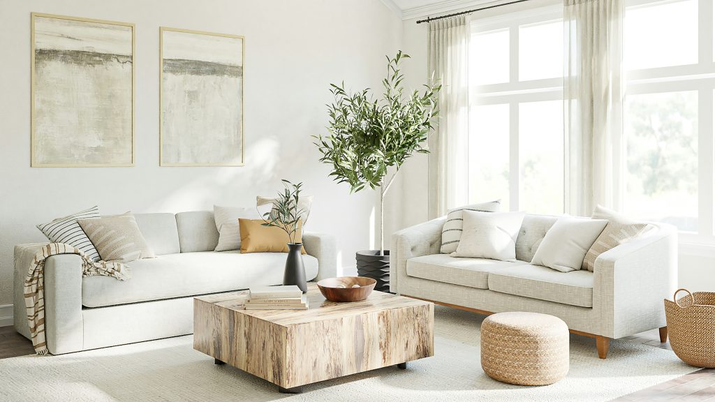
- Neutral Tones: White, beige, grey, and cream remain popular for their timeless appeal and versatility. They act as a canvas, letting furniture and artwork shine.
Examples:
- Blue for calm and relaxation: Perfect for bedrooms and bathrooms, soft blues help lower stress and create a spa-like feel.
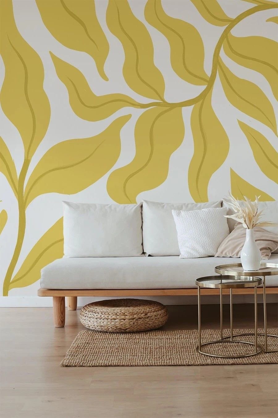
- Yellow for energy and brightness: Kitchens and dining areas benefit from yellows that add warmth and cheer.
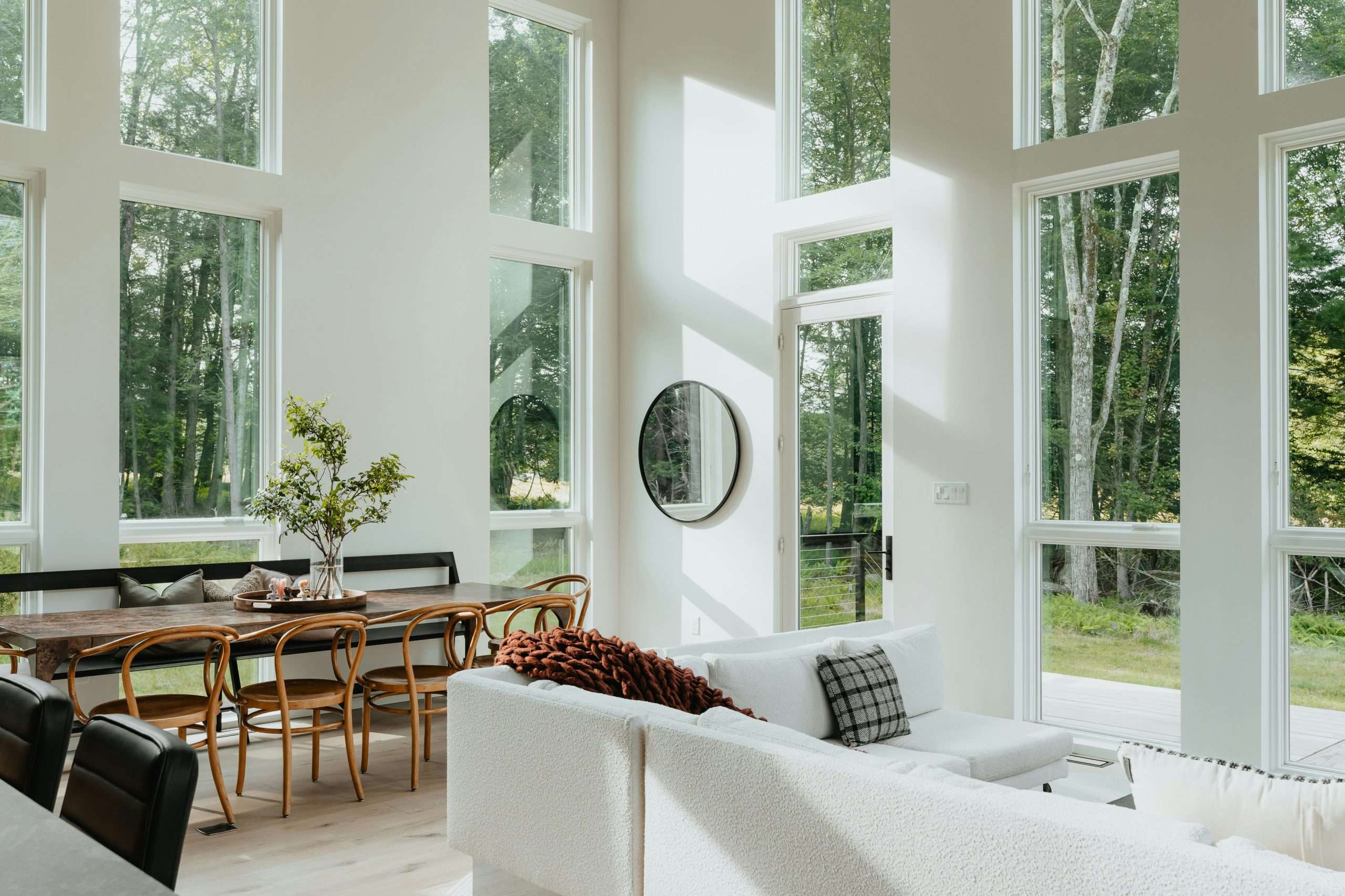
- Neutral tones for timeless elegance: These shades suit open-plan living spaces in Melbourne homes, providing a clean, adaptable base.
By understanding the psychology behind colour, you can make deliberate choices that support how you want to use each space.
Choosing the Right Colours for Each Room
Every room has its own purpose, and the paint you choose should support that function.
Living Room
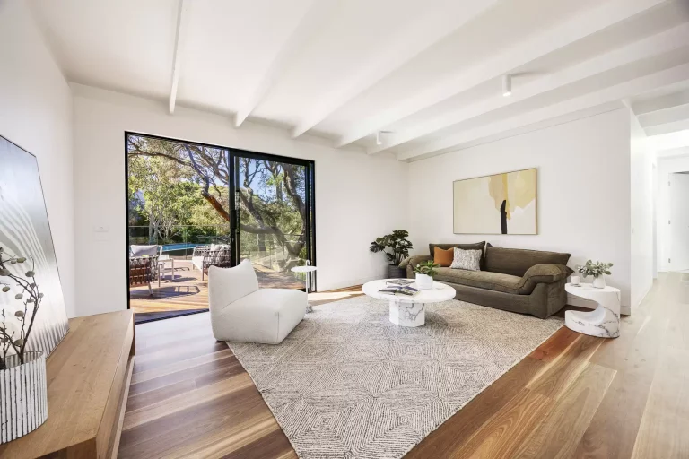
As the central gathering place, the living room benefits from welcoming and versatile tones. Soft greys, earthy greens, or warm beige create a neutral base that pairs well with seasonal décor. For homeowners in Melbourne’s older period homes, deeper tones like charcoal or navy can highlight high ceilings and ornate trims.
Bedroom
Your bedroom is a retreat, and restful shades like muted blues, lilac, or pastel pinks work well. These tones reduce visual stimulation and help prepare the mind for rest. For a bolder option, dark green or navy can create a cocooning effect when balanced with lighter linens and furnishings.
Kitchen & Dining
Paint plays a functional role in kitchens and dining rooms. Lighter shades reflect natural light, making the space feel fresh and hygienic. Green is growing in popularity, reflecting Melbourne’s trend towards earthy, organic interiors. Yellow can also add warmth and appetite to family dining spaces.
Home Office
As more Australians work from home, paint choices in offices have become increasingly important. Blues and greens help with focus, while light greys provide a clean and distraction-free environment. For those wanting a creative boost, accents of burnt orange or mustard can introduce energy without overwhelming the space.
Bathroom
Bathrooms often benefit from light, fresh colours that reflect cleanliness. Whites, pale blues, and soft greys are popular. For a modern twist, darker feature walls in navy or charcoal can make a statement, especially when paired with brass fixtures or stone finishes.
Interior Painting Styles and Techniques
How you apply paint is just as important as the colour you choose.
- Accent Walls: Highlight one wall with a bold colour to create a focal point. This works well in bedrooms behind the bedhead or in living rooms behind entertainment units.
- Colour Blocking: Use contrasting blocks of paint to divide spaces visually. This is ideal for open-plan Melbourne apartments where separate areas need definition.
- Ombre and Gradient Effects: Blend colours seamlessly for a soft, artistic effect. This technique suits feature walls in nurseries or creative studios.
- Textured Painting: Techniques like sponging, rag rolling, or stencilling add character and can hide minor imperfections in walls.
- Statement Ceilings and Painted Trim: Rather than defaulting to white, experiment with coloured ceilings or bold trims. This can make period features pop in heritage homes across suburbs like Brunswick and Fitzroy.
How to Match Paint Colours with Your Home’s Decor
Paint doesn’t exist in isolation, it must work with your furniture, flooring, and overall style.
- Coordinate with Furniture and Flooring: Match wall tones to complement large, permanent pieces such as couches or timber floors.
- Highlight Features: Use contrasting colours to draw attention to fireplaces, cornices, or window frames.
- Balance Bold Choices: If you select a dramatic colour for the walls, keep furniture neutral to avoid overcrowding the space.
- Layering and Matching: Combine shades from the same colour family for a cohesive look. For example, pairing soft grey walls with charcoal trims and black accents creates depth without clashing.
Popular Interior Painting Trends in 2025
Looking ahead, Melbourne homeowners are embracing a mix of natural and bold styles:
- Earthy, Nature-Inspired Tones: Olive green, terracotta, and warm clay shades connect indoor living with the outdoors, reflecting Melbourne’s love for sustainable design.
- Bold Jewel Tones: Emerald, sapphire, and ruby are making a comeback, offering dramatic elegance for statement spaces.
- Muted Pastels: Dusty pinks, pale lavender, and mint suit minimalist, calming interiors.
- Two-Tone Walls: Horizontal divisions create contrast while adding modern sophistication.
- Geometric Patterns: Angled designs and painted shapes are increasingly popular in children’s bedrooms and creative studios.
Practical Tips Before You Start Painting
Preparation is key to achieving a professional-looking finish.
- Sample Colours: Always test paint in multiple areas of a room to see how it looks under natural daylight and artificial lighting.
- Consider Lighting: North-facing rooms in Melbourne get warmer light, while south-facing rooms tend to be cooler. Choose colours accordingly.
- Select the Right Finish: Matte hides imperfections, satin provides subtle sheen, and gloss works well on trims.
- Use Quality Tools: Invest in good brushes and rollers for even coverage.
- Budget-Friendly Ideas: If you’re painting on a budget, focus on feature walls or trims rather than full-room makeovers.
For lasting results, many homeowners choose to hire a professional painter who can deliver a flawless finish with less disruption.
Common Mistakes to Avoid
Some errors can undo all your hard work:
- Overusing Dark Shades: While moody tones are stylish, they can shrink small spaces. Use them sparingly.
- Ignoring Ceilings and Trims: These elements can enhance or undermine your chosen palette.
- Skipping Primer: This often leads to uneven finishes and poor paint adhesion.
- Chasing Trends Blindly: What’s stylish today may not suit your long-term preferences. Choose colours that feel right for you.
Conclusion
Interior painting is about more than a fresh look, it’s about creating spaces that work for your lifestyle. By understanding colour psychology, selecting shades for each room’s purpose, and experimenting with styles, you can create a home that feels both beautiful and functional.
For Melbourne homeowners looking to achieve a polished result, speaking with a colour consultant or engaging a professional painter can take the stress out of the process and deliver long-lasting value.
FAQ
What colours make a room look bigger?
Light shades like whites, pale greys, and soft blues reflect more light, making rooms feel larger.
How often should I repaint interiors?
Every 5-7 years is common, but high-traffic areas such as hallways may need touch-ups more often.
Should I choose matte or gloss paint?
Matte works for walls, especially in bedrooms or living areas. Gloss is better for trims, doors, and high-traffic areas.
Can painting add property value?
Absolutely. A professional paint job can boost appeal and even increase resale value. Read more about how a paint job can add value.
Should I paint myself or hire a professional?
DIY is possible, but professionals save time and ensure a consistent finish. Learn more about how to choose the right painter.